
선형 회귀 분석
실습 데이터
🔗 실습 링크 : https://www.kaggle.com/datasets/mragpavank/insurance1
Medical Cost Personal Datasets
Medical Cost Personal Datasets
www.kaggle.com
- 건강 및 인구 통계학적 정보와 개인의 의료비 정보를 모아둔 데이터
- 변수 :
- 나이
- 성별
- 체지방 지수 (BMI)
- 부양가족수
- 흡연유무
- 사는지역 : 미국 내 북동/남동/남서/북서
- 개인 의료비 (charges)
문제 정의
: 주어진 [독립변수]건강 및 인구통계학적 정보를 바탕으로 개인의 [종속변수]연간 의료 보험료를 예측
1단계. 데이터 로드
import numpy as np

seed = 1234
np.random.seed(seed)import pandas as pd
# 데이터 경로 지정 및 읽어오기
data_path = '/content/MedicalCostDatasets.csv'
insurance_data = pd.read_csv(data_path)
# 데이터 꼴 확인
insurance_data.head()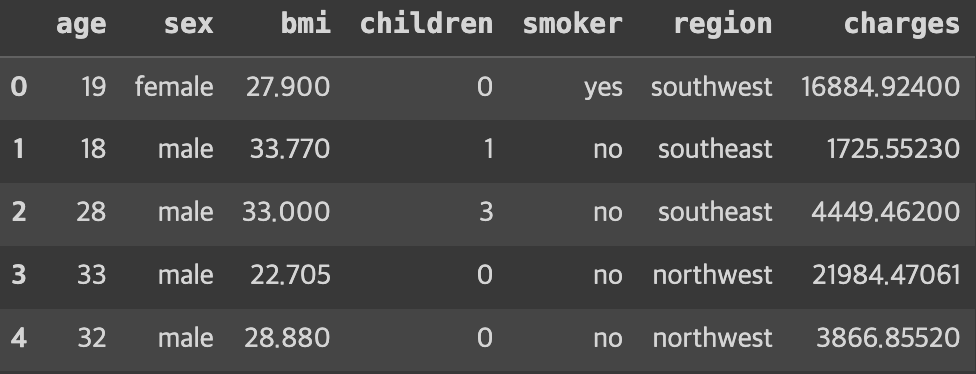
2단계. EDA
: 데이터 분석 초기 단계 진행 과정으로, 데이터를 여러 각도에서 살피며 데이터의 특징, 구조, 패턴, 이상치, 변수 간의 관계 등을 이해
- 기초 통계 분석 : 평균, 중앙값, 표준편차, 최솟/최댓값 등
- 시각화 : 데이터 패턴, 이상치, 경향성 식별
- 변수간 관계 파악 : 서로 다른 변수간 상관관계 분석
- 이상치 탐지 : 다른 데이터의 특성에서 벗어난 비정상적 데이터 식별
- 결측치 분석 : 누락 데이터 확인
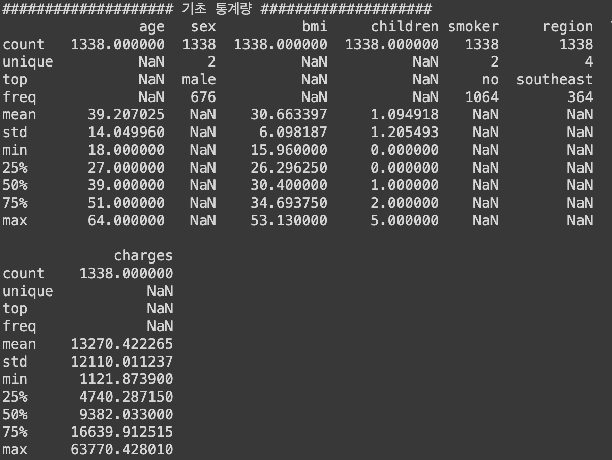
1) 기본 정보 및 기초 통계량 분석
# 기본 정보
print('#'*20, '기본 정보', '#'*20)
insurance_data.info() # info() 안에서 자동으로 print를 진행

# 기초 통계량
summary_statistics = insurance_data.describe(include='all')
print('#'*20, '기초 통계량', '#'*20)
print(summary_statistics)
2) 시각화 - 수치형 데이터
## 시각화 - 수치형 데이터
# 분포 확인

import matplotlib.pyplot as plt

plt.figure(figsize=(14, 10))

# 나이 분포
plt.subplot(2, 2, 1)
plt.hist(insurance_data['age'], color='skyblue', edgecolor='black')
plt.title('Age Distribution')
plt.xlabel('Age')
plt.ylabel('Frequency')

# BMI 분포
plt.subplot(2, 2, 2)
plt.hist(insurance_data['bmi'], bins=30, color='olive', edgecolor='black')
plt.title('BMI Distribution')
plt.xlabel('BMI')
plt.ylabel('Frequency')

# 부양가족 분포
plt.subplot(2, 2, 3)
plt.hist(insurance_data['children'], color='gold', edgecolor='black')
plt.title('Number of Children Distribution')
plt.xlabel('Number of Children')
plt.ylabel('Frequency')

# 의료비 분포
plt.subplot(2, 2, 4)
plt.hist(insurance_data['charges'], bins=30, color='teal', edgecolor='black')
plt.title('Charges Distribution')
plt.xlabel('Charges')
plt.ylabel('Frequency')

plt.tight_layout()
plt.show()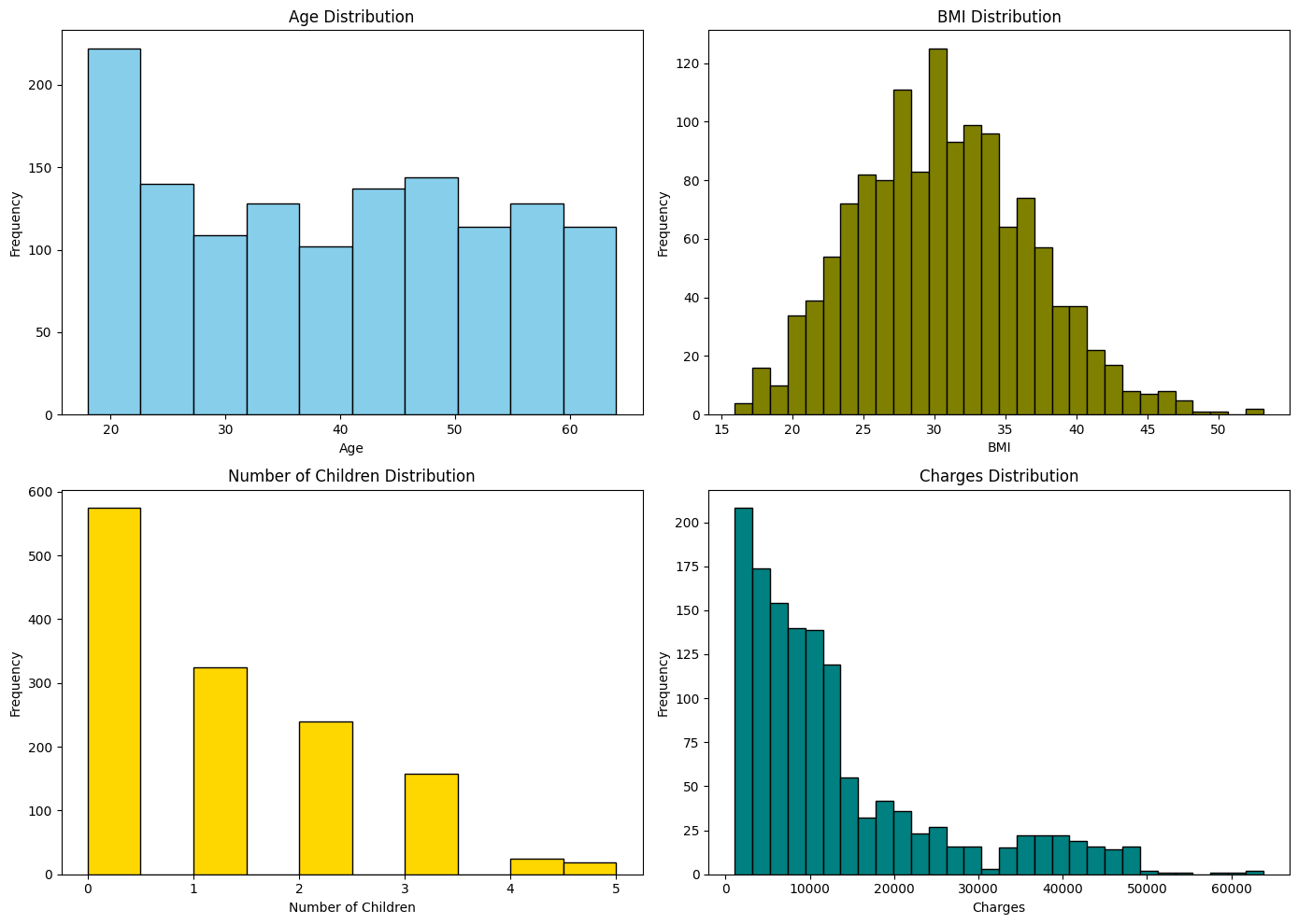
► 알 수 있는 정보
- 나이 분포 : 상대적으로 균일한 분포로 큰 편중이 없음
- BMI 분포 : 정규분포와 유사한 형태를 보임
- 부양 가족수 분포 : 대부분 0~2명의 자녀를 갖고있음
- 의료비 분포 : 오른쪽으로 꼬리가 긴 분포 → 로그 분석하면 평평해질수도 있음
3) 상관관계 분석
: 데이터 특성들끼리 얼마 만큼의 관계도를 갖고있는지 분석 가능
correlation_matrix = insurance_data.corr()

# 상관관계 메트릭스 시각화
plt.figure(figsize=(5, 4))

plt.matshow(correlation_matrix, fignum=1)
plt.colorbar()
plt.xticks(range(len(correlation_matrix.columns)), correlation_matrix.columns, rotation=90)
plt.yticks(range(len(correlation_matrix.columns)), correlation_matrix.columns)
plt.title('Correlation Matrix of Medical Cost Datasets', y=1.15)
plt.show()

# 상관관계 값 프린트
print('#'*20, '상관관계 값 확인', '#'*20)
print(correlation_matrix)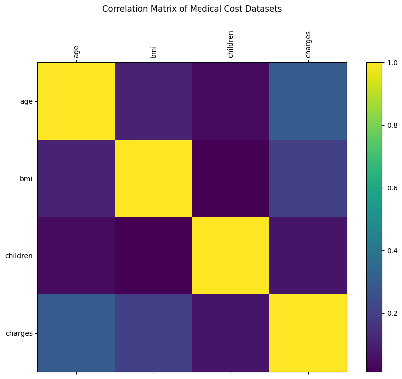
4) 시각화 - 범주형 데이터
## 시각화 - 범주형 데이터
# 분포 확인

plt.figure(figsize=(18, 5))

# 성별에 따른 의료비용
plt.subplot(1, 3, 1)
plt.boxplot([insurance_data[insurance_data['sex']=='male']['charges'],
             insurance_data[insurance_data['sex']=='female']['charges']],
            labels=['Male', 'Female'])
plt.title('Charges by Sex')
plt.ylabel('Charges')

# 흡연 유무에 따른 의료비용
plt.subplot(1, 3, 2)
plt.boxplot([insurance_data[insurance_data['smoker']=='yes']['charges'],
             insurance_data[insurance_data['smoker']=='no']['charges']],
            labels=['Smoker', 'Non-smoker'])
plt.title('Charges by Smoker')
plt.ylabel('Charges')

# 거주 지역에 따른 의료비용
plt.subplot(1, 3, 3)
regions = insurance_data['region'].unique()
region_charges = [insurance_data[insurance_data['region']==region]['charges'] for region in regions]
plt.boxplot(region_charges, labels=regions)
plt.title('Charges by Region')
plt.ylabel('Charges')

plt.tight_layout()
plt.show()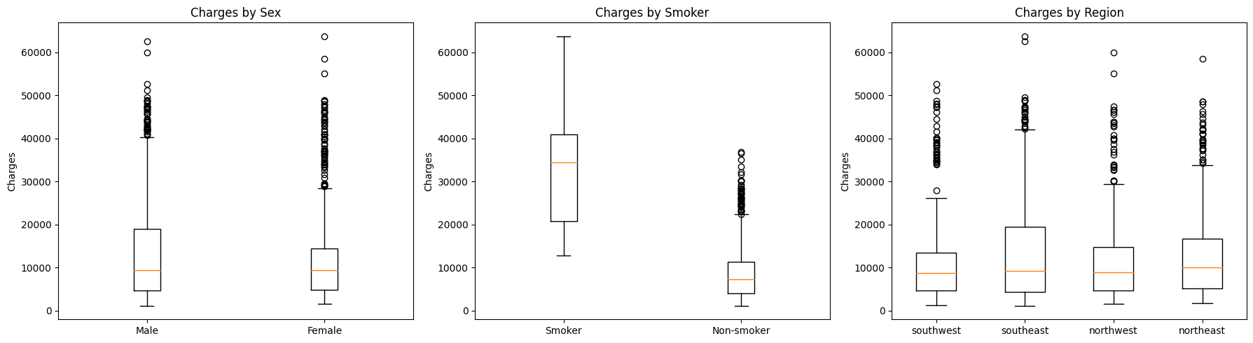
► 알 수 있는 정보
- 성별
- 성별에 따른 의료비용 분포에 약간의 차이가 있음
- 남성의 경우, 여성보다 의료비용을 좀 더 많이 냄
- 흡연여부
- 흡연 유무는 매우 두드러지는 차이를 보임
- 종속 변수에 영향을 미치는 큰 요인으로 보임
- 지역별
- 차이는 보이지만 흡연 유무만큼은 아님
3단계. 데이터 전처리
1) 범주형 변수 인코딩
범주형 데이터를 선형 모델에 입력으로 사용하기 위해서는 수치형 데이터로 변환해줘야 함
📌 One-hot Encoding
: 각 클래스별로 별도의 컬럼을 만들고 각각에 해당하면 1 아니면 0의 값으로 표현하는 전처리 방법
- 예를 들어, 성별이라면
- `성별_남성`과 `성별_여성` 이라는 별도의 열을 만들고
- 각각을 0과 1의 값으로 표현
- Pandas의 `get_dummies()` 함수를 사용
- `drop_first` : 첫 카테고리를 제거할지 여부를 설정
(새롭게 생겨난 변수들의 강한 상관관계가 나타나서 다중공선성 문제가 발생할 수 있으므로, 보통은 제거하는 것이 좋음)- `True` : 제거 O → 하나의 컬럼만 보고다 다른 컬럼을 유추할 수 있기 때문에 제거하는 것이 좋음
- `False` : 제거 X
- `drop_first` : 첫 카테고리를 제거할지 여부를 설정
insurance_encoded = pd.get_dummies(insurance_data, drop_first=True)
insurance_encoded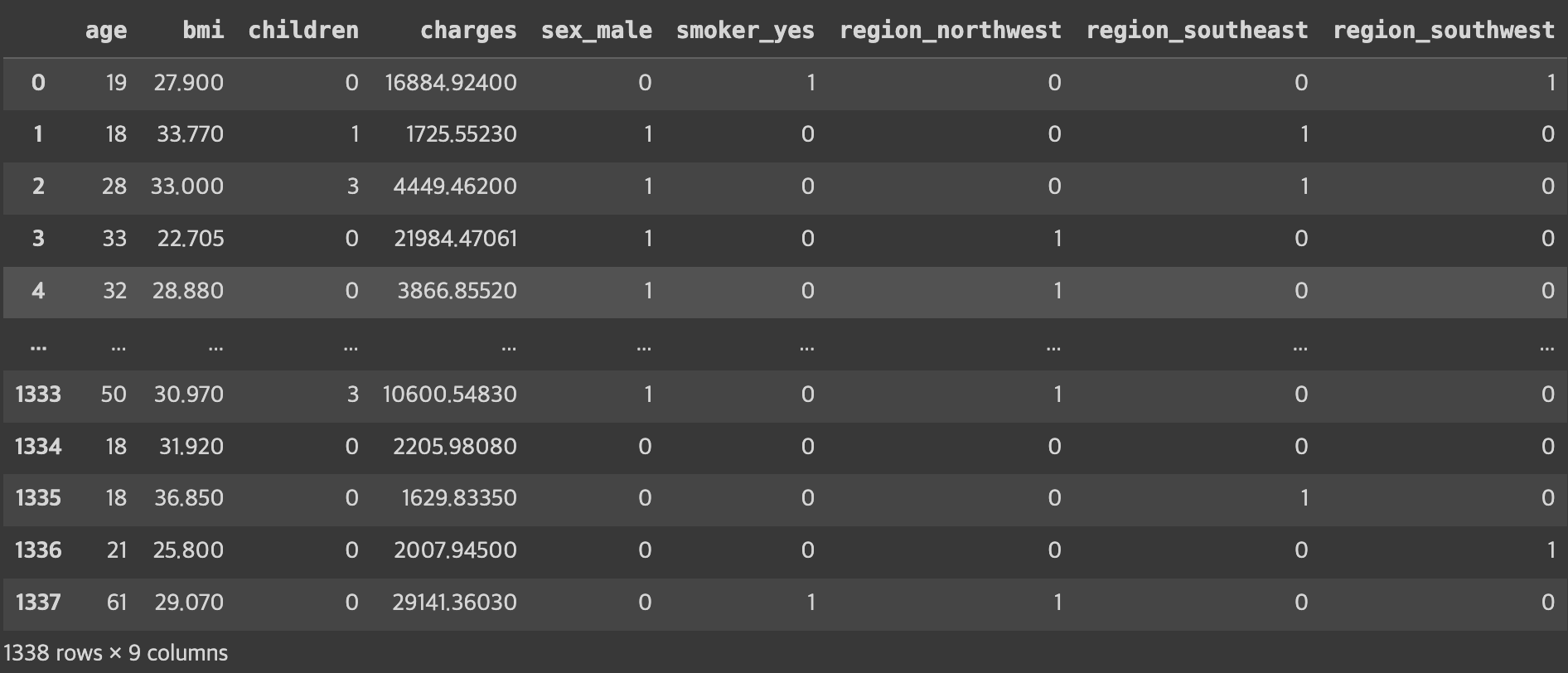
4단계. 데이터 분리 (학습/평가)
- 학습 / 평가 → `train_test_split()` 함수 1번 사용
- 학습 / 검증 / 평가 → `train_test_split()` 함수 2번 사용
from sklearn.model_selection import train_test_split

# 독립변수와 종속변수 분리
y_column = ['charges']
X = insurance_encoded.drop(y_column, axis=1)
y = insurance_encoded[y_column]

# 학습 데이터와 평가 데이터로 분리 (독립변수, 종속변수 각각)
X_train, X_test, y_train, y_test = train_test_split(X, y,
                                                    test_size=0.2,
                                                    random_state=42)
5단계. 특성 스케일링 (필수X)
: 서로 다른(수치적 범위 차이가 많이 나는) 데이터 특성 사이의 값 범위를 비슷하게 맞춰주는 과정
- 효과
- 특히 경사하강법을 사용하는 과정에서 수렴 속도를 높일 수 있음
- 규제모델을 사용한다면 일부 특성에 강하게 규제가 걸리는 과정을 회피할 수 있음
- 방법
- StandardScaler
- 평균0, 표준편차1로 조정
- 데이터의 분포가 정규분포일 경우 사용하면 제일 좋음
- 일반적으로 많이 사용
- MinMaxScaler
- 최댓값1, 최솟값0이 되도록 조정
- 이상치가 큰 영향을 미치는 경우 사용
- StandardScaler
## 특성 스케일링

from sklearn.preprocessing import StandardScaler

# 스케일링 할 데이터 컬럼을 지정
encoded_columns = list(set(insurance_encoded.columns) - set(insurance_data.columns)) # ['region_southwest', 'region_southeast', 'region_northwest', 'smoker_yes', 'sex_male']
continuous_columns = list(set(insurance_encoded.columns) - set(encoded_columns) - set(y_column)) # ['bmi', 'age', 'children']

## 정규 분포로 스케일링
scaler = StandardScaler()

# 수치형 데이터만 스케일링 진행
X_train_continuous = scaler.fit_transform(X_train[continuous_columns])
X_test_continuous = scaler.fit_transform(X_test[continuous_columns])

# 스케일 된 데이터와 스케일에 사용되지 않은 데이터 조합
X_train_continuous_df = pd.DataFrame(X_train_continuous, columns=continuous_columns)
X_test_continuous_df = pd.DataFrame(X_test_continuous, columns=continuous_columns)

X_train_categorical_df = X_train[encoded_columns].reset_index(drop=True)
X_test_categorical_df = X_test[encoded_columns].reset_index(drop=True)

X_train_final = pd.concat([X_train_continuous_df, X_train_categorical_df], axis=1)
X_test_final = pd.concat([X_test_continuous_df, X_test_categorical_df], axis=1)# 결과 확인
X_train_final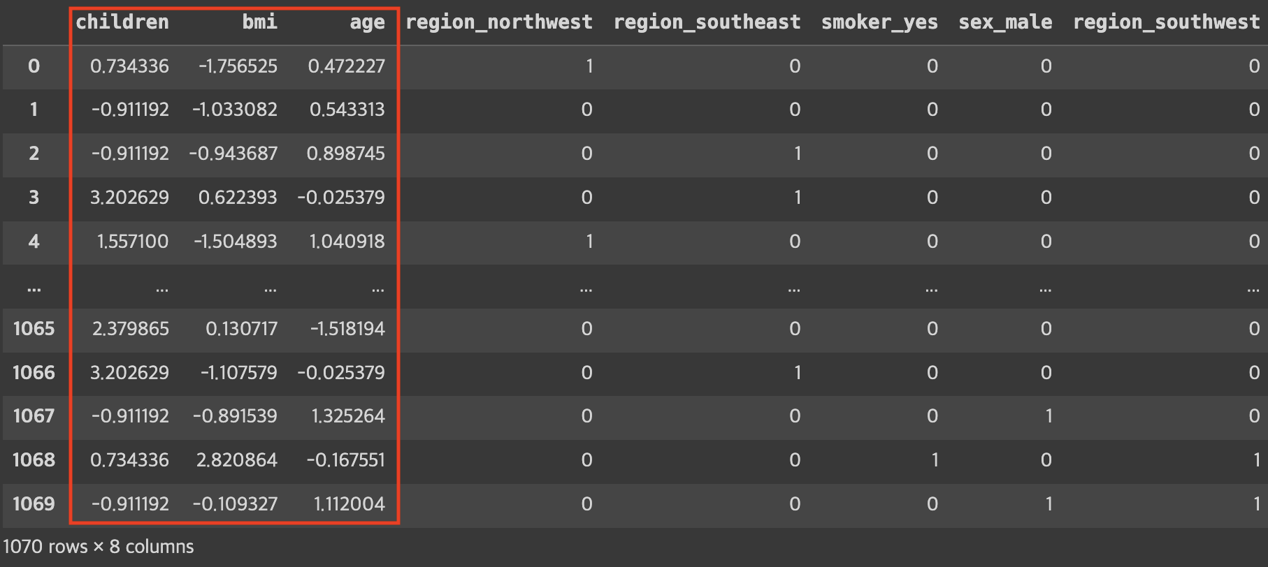
6단계. 선형 회귀 모델 학습
- 𝑤0 값을 위해 bias(절편)를 추가해줌
- 내장 함수를 이용하면 자동으로 추가해서 결과를 보여줌
- 굳이 추가하지 않아도 되긴 함
- `LinearRegression()` 객체를 생성 후 학습 진행
from sklearn.linear_model import LinearRegression

# w0에 해당하는 편향(bias) 부분을 추가
# 이론 과정에서는 식의 형태로 인해 맨 앞쪽에 넣었지만
# 위치는 크게 상관이 없음 (여기서는 맨 뒤로 들어감)
X_train_final['bias'] = 1
X_test_final['bias'] = 1

# 선형 회귀 모델 초기화 및 학습
linear_reg = LinearRegression()
linear_reg.fit(X_train_final, y_train)

# 학습된 모델의 계수(coefficients) 및 절편(intercept) 출력
coefficients = linear_reg.coef_
intercept = linear_reg.intercept_

print('#'*20, '학습된 파라미터 값', '#'*20)
print(coefficients)

print('#'*20, '학습된 절편 값', '#'*20)
print(intercept)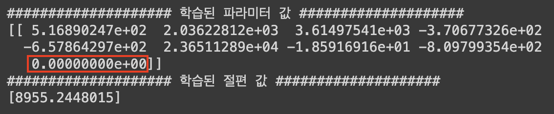
7단계. 학습한 모델 평가
1) MSE
- MSE값을 이용해 평균적인 예측/실패 정도를 판단할 수 있음
(※ MSE 값으로 잘 한건지/아닌지 여부를 판단하기가 어려움)
from sklearn.metrics import mean_squared_error

# 예측 수행
y_train_pred = linear_reg.predict(X_train_final)
y_test_pred = linear_reg.predict(X_test_final)

# 평가 지표 계산: MSE
mse_train = mean_squared_error(y_train, y_train_pred)
mse_test = mean_squared_error(y_test, y_test_pred)

print('학습 데이터를 이용한 MSE 값 :', mse_train)
print('평가 데이터를 이용한 MSE 값 :', mse_test)
2) 산점도 시각화
- 𝑦=𝑥 그래프와 가까울수록 좋은 예측
# 테스트 데이터셋에 대한 실제 값과 예측 값을 산점도로 시각화
plt.figure(figsize=(10, 6))
plt.scatter(y_test, y_test_pred, alpha=0.6)
plt.plot([y_test.min(), y_test.max()], [y_test.min(), y_test.max()], 'k--') # 완벽한 예측을 나타내는 대각선
plt.xlabel('Real Values')
plt.ylabel('Predict Values')
plt.title('Real vs Predict')
plt.show()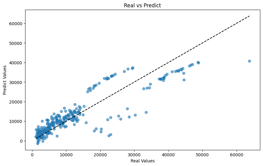
8단계. 결과 해석
1) 변수 중요도
- 각 변수들이 모델을 예측함에 어느 정도로 영향을 미치는지 파악할 수 있음
coeff_df = pd.DataFrame({'feature': X_train_final.columns, 'coefficient': linear_reg.coef_.flatten()})

# 계수의 절대값을 기준으로 내림차순 정렬
coeff_df['abs_coefficient'] = coeff_df['coefficient'].abs()
coeff_df_sorted = coeff_df.sort_values(by='abs_coefficient', ascending=False)

# 변수의 영향력을 확인
coeff_df_sorted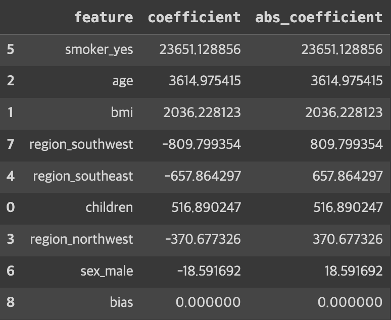
# 변수 영향력 시각화
plt.figure(figsize=(10, 6))
plt.barh(X_train_final.columns, linear_reg.coef_.flatten())
plt.xlabel('Coefficient')
plt.ylabel('Features')
plt.title('Features Importance')
plt.show()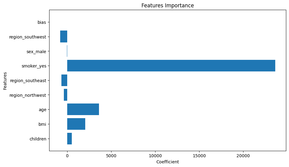
► 알 수 있는 정보
- 흡연 여부가 yes일수록 의료비에 영향을 많이 미친다
- 나이, bmi도 꽤 영향을 미친다.
2) 잔차 분석
- 예측이 정답과 차이가 얼마만큼 나는지 잔차(residual)의 분포를 통해 확인할 수 있음
- 무작위 분포 = 좋은 분포
- 특정 패턴이 존재하는 분포 = 데이터를 완전히 파악하지 못함
# 정답과의 차이를 보이는 잔치(residual)을 시각화해
# 이것의 분포를 확인해 데이터의 패턴을 알마나 잘 포착하는지를 판단
# 무작위로 분포되어야 좋은 상황

# 잔차 도출
y_pred = linear_reg.predict(X_train_final)
residuals = y_train - y_pred

# 잔차 시각화
plt.figure(figsize=(10, 6))
plt.scatter(y_pred, residuals)
plt.axhline(y=0, color='red', linestyle='--')
plt.xlabel('Predict')
plt.ylabel('Residual')
plt.title('Residual Analysis')
plt.show()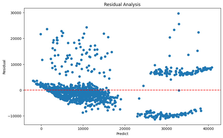
► 알 수 있는 정보
- 예측값이 커질수록 분포가 넓어짐
- 큰 예측값에서 2개의 그룹이 존재
- 의료비가 큰 경우 해석력이 떨어지므로 비선형적 특성이 있을 수 있음
- 비선형 모델을 선택하거나, 로그 혹은 제곱근 변환 등의 비선형 근사법 적용
- EDA에서 살펴본 이상치의 영향이 있을 수 있으므로 이상치 제거
선형 분류 분석
실습 데이터
🔗 실습 링크 : https://www.kaggle.com/datasets/sjleshrac/airlines-customer-satisfaction
Airlines Customer satisfaction
Customer satisfaction with various other factors
www.kaggle.com
문제 정의
: 주어진 [독립변수]탑승객의 개인 및 여행 경험 정보를 바탕으로 전반적인 [종속변수]비행의 만족도를 예측
1단계. 데이터 로드
import numpy as np

seed = 1234
np.random.seed(seed)

import pandas as pd

# 데이터 경로 지정 및 읽어오기
data_path = '/content/Invistico_Airline.csv'
airplane = pd.read_csv(data_path)
2단계. EDA
1) 기본 분석 및 기초 통계 분석
데이터타입
- 수치형 (Numerical)
- 서수형 (Ordinal)
- 순서나 등급을 나타냄
- 순서는 중요하지만 그 차이는 균일하지 않음
- ex) 설문조사,학점,통증수준 등
- 범주형 (Categorical)
# 기본 정보
print('#'*20, '기본 정보', '#'*20)
airplane.info() # info() 안에서 자동으로 print를 진행

# 기초 통계량
summary_statistics = airplane.describe(include='all')
print('#'*20, '기초 통계량', '#'*20)
print(summary_statistics)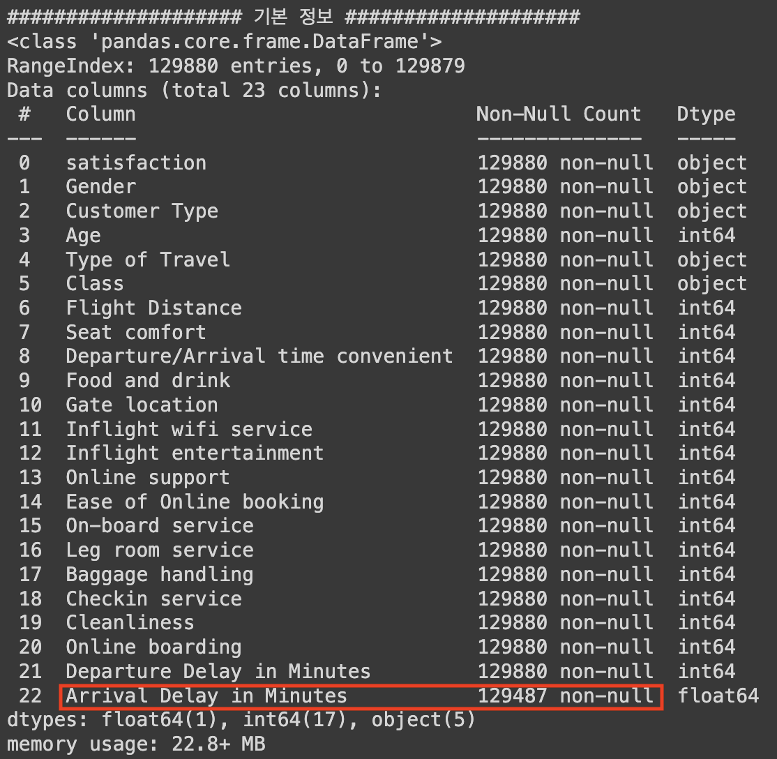
► `Arrival Delay in Minutes` 컬럼에 결측치가 있음을 확인할 수 있다.
## 컬럼 확인해보기
airplane.columns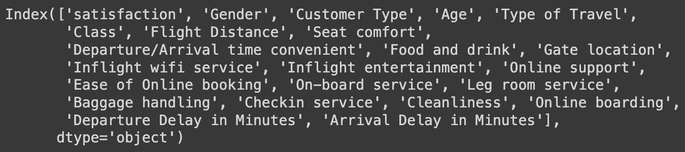
## 데이터 자료형에 따른 column 구분

# 종속 변수
y_column = ['satisfaction']

# 독립변수 - 수치형
numeric_columns = ['Age', 'Flight Distance',
                   'Departure Delay in Minutes', 'Arrival Delay in Minutes']

# 독립변수 - 서수형
ordinal_columns = ['Seat comfort', 'Departure/Arrival time convenient',
                   'Food and drink', 'Gate location',
                   'Inflight wifi service', 'Inflight entertainment',
                   'Online support', 'Ease of Online booking',
                   'On-board service', 'Leg room service',
                   'Baggage handling', 'Checkin service',
                   'Cleanliness', 'Online boarding']

# 독립변수 - 범주형
category_columns = ['Gender', 'Customer Type',
                    'Type of Travel', 'Class']
2) 시각화 - 수치형 데이터
# 전체 데이터 분포 확인

numeric_data = airplane[numeric_columns]

import matplotlib.pyplot as plt
plt.figure(figsize=(14, 10))

np.random.seed(seed)
for idx, numeric in enumerate(numeric_columns) :
    col = (np.random.random(), np.random.random(), np.random.random())

    plt.subplot(2, 2, idx+1)
    plt.hist(numeric_data[numeric], bins=30, color=col, edgecolor='black')
    plt.title(f'{numeric} Distribution')
    plt.xlabel(numeric)
    plt.ylabel('Frequency')

plt.tight_layout()
plt.show()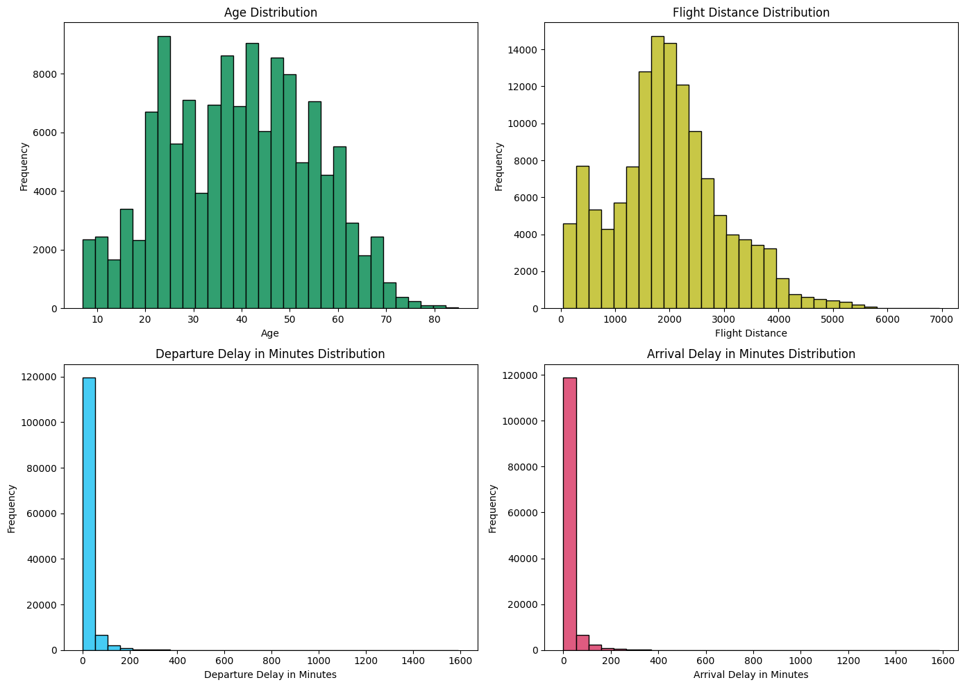
분류 문제 해결이 목적이기 때문에 클래스 별로 시각화 해보았다.
# 클래스 별 시각화
satisfied = airplane[airplane['satisfaction'] == 'satisfied']
dissatisfied = airplane[airplane['satisfaction'] == 'dissatisfied']

plt.figure(figsize=(15, 15))

for idx, column in enumerate(numeric_columns):
    plt.subplot(len(numeric_columns), 2, 2*idx + 1)
    plt.hist(satisfied[column], color='blue', label='Satisfied', bins=30, edgecolor='black')
    plt.title(f'Satisfied - {column}')

    plt.subplot(len(numeric_columns), 2, 2*idx + 2)
    plt.hist(dissatisfied[column], color='red', label='Dissatisfied', bins=30, edgecolor='black')
    plt.title(f'Dissatisfied - {column}')

plt.tight_layout()
plt.show()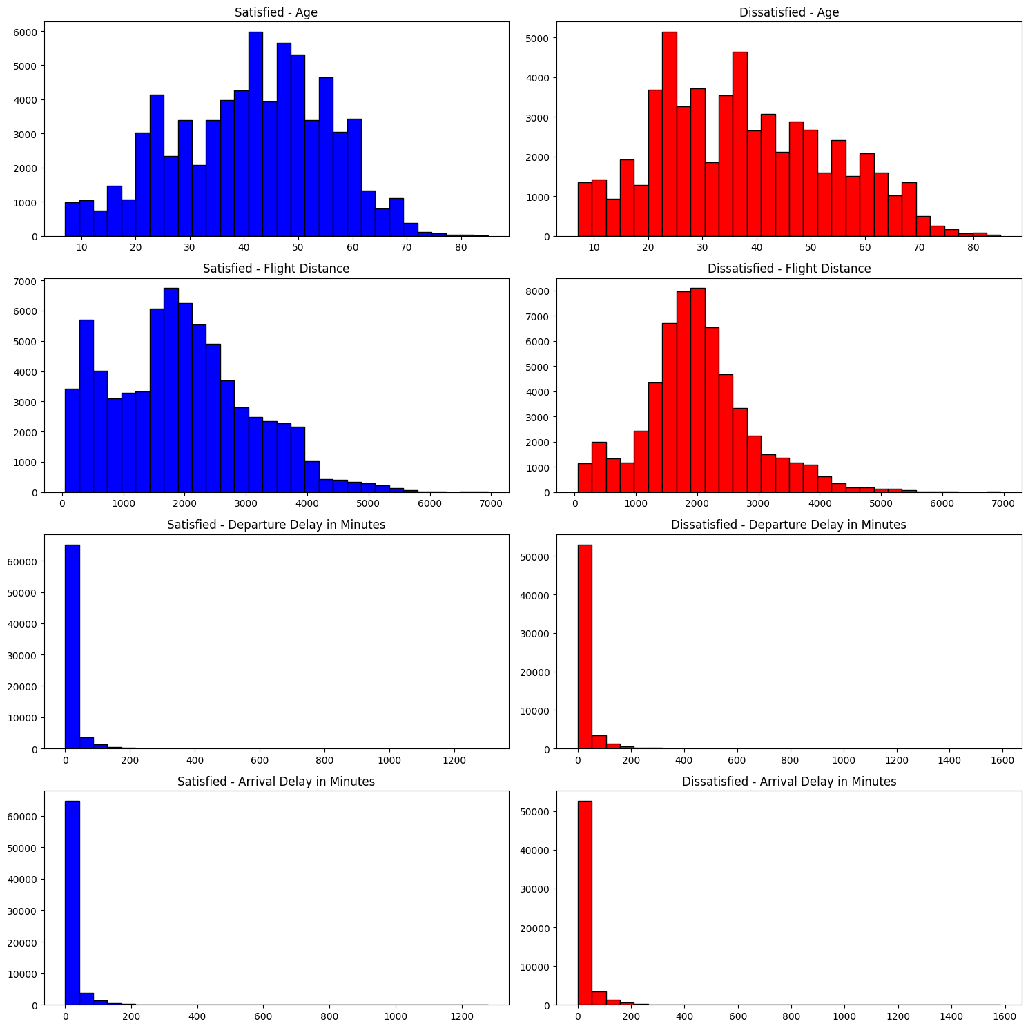
► 알 수 있는 정보
- 중년층이 만족도가 높고, 젊은층이 불만족도가 높음
- 비행 거리가 짧을수록 만족도가 높고, 길수록 불만족도가 높음
def clip_delays(df, min_value, max_value):
    df['Departure Delay in Minutes'] = df['Departure Delay in Minutes'].clip(min_value, max_value)
    df['Arrival Delay in Minutes'] = df['Arrival Delay in Minutes'].clip(min_value, max_value)
    return df

min_delay = 5
max_delay = 300

satisfied_clipped = clip_delays(satisfied.copy(), min_delay, max_delay)
dissatisfied_clipped = clip_delays(dissatisfied.copy(), min_delay, max_delay)

plt.figure(figsize=(10, 5))

plt.subplot(1, 2, 1)
plt.hist(satisfied_clipped['Departure Delay in Minutes'], color='blue', label='Satisfied', bins=30, alpha=0.7)
plt.hist(dissatisfied_clipped['Departure Delay in Minutes'], color='red', label='Dissatisfied', bins=30, alpha=0.7)
plt.title('Departure Delay in Minutes (Non-Zero)')
plt.legend()

plt.subplot(1, 2, 2)
plt.hist(satisfied_clipped['Arrival Delay in Minutes'].dropna(), color='blue', label='Satisfied', bins=30, alpha=0.7)
plt.hist(dissatisfied_clipped['Arrival Delay in Minutes'].dropna(), color='red', label='Dissatisfied', bins=30, alpha=0.7)
plt.title('Arrival Delay in Minutes (Non-Zero)')
plt.legend()

plt.tight_layout()
plt.show()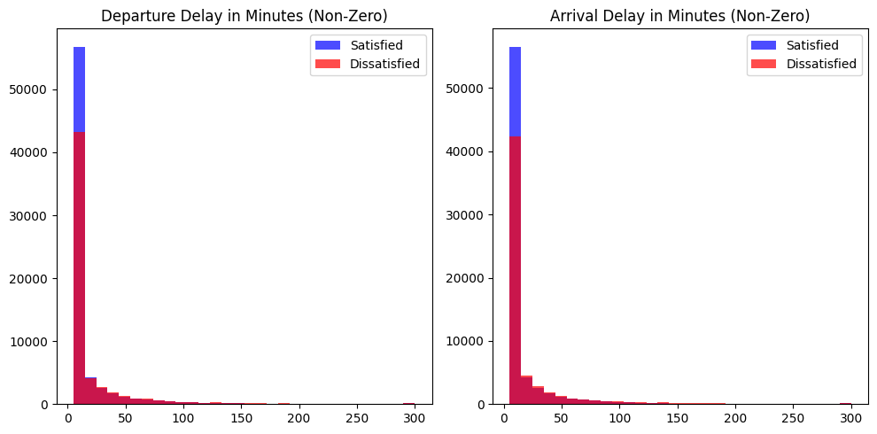
3) 이상치 확인 - 수치형 데이터
plt.figure(figsize=(8, 8))

np.random.seed(seed)
for idx, numeric in enumerate(numeric_columns) :

    plt.subplot(2, 2, idx+1)
    plt.boxplot(numeric_data[numeric].dropna(), labels=[numeric])

plt.tight_layout()
plt.show()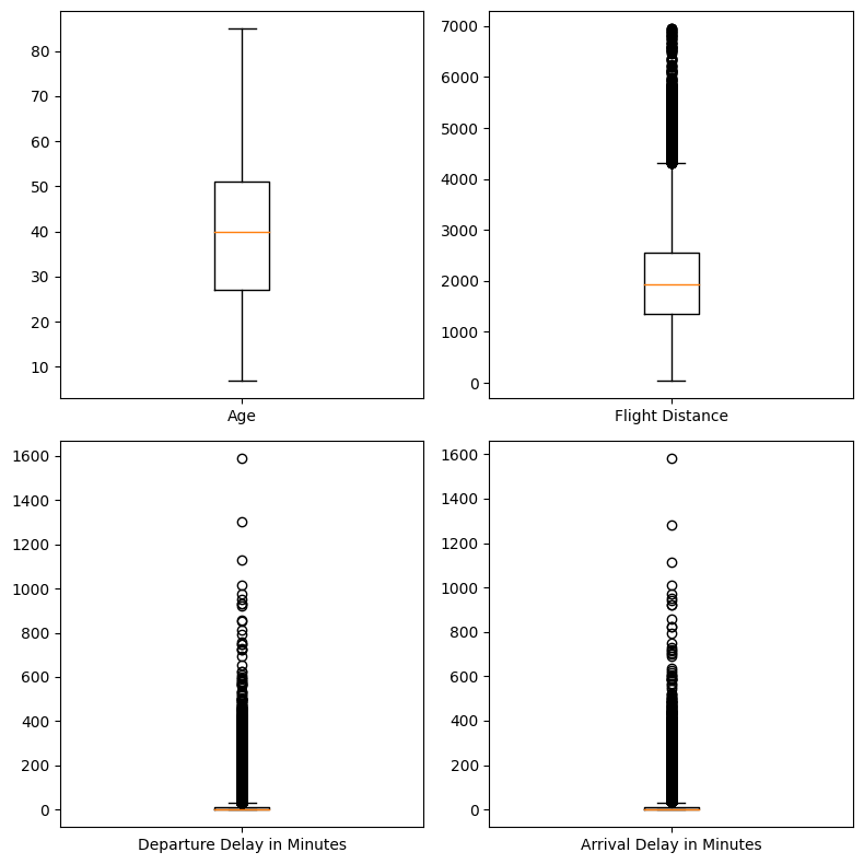
4) 상관관계 분석 - 수치형 데이터
correlation_matrix = numeric_data.corr()

# 상관관계 메트릭스 시각화
plt.figure(figsize=(5, 5))

plt.matshow(correlation_matrix, fignum=1)
plt.colorbar()
plt.xticks(range(len(correlation_matrix.columns)), correlation_matrix.columns, rotation=90)
plt.yticks(range(len(correlation_matrix.columns)), correlation_matrix.columns)

for (i, j), val in np.ndenumerate(correlation_matrix):
    plt.text(j, i, '{:0.2f}'.format(val), ha='center', va='center', color='black')

plt.show()

# 상관관계 값 프린트
print('#'*20, '상관관계 값 확인', '#'*20)
print(correlation_matrix)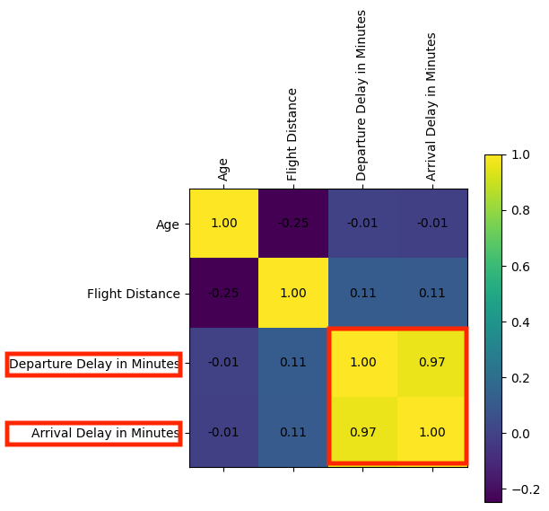
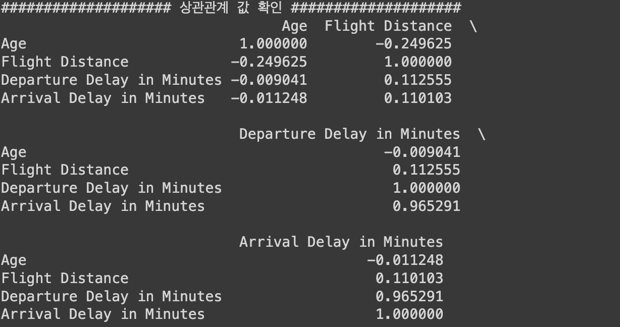
► 알 수 있는 정보
- `Departure Delay in Minutes`와 `Arrival Delay in Minutes`간 상관관계가 매우 강하다.
(= 선형 모델에 같이 쓸 수 없음. 둘 중 하나 제거해야함)
5) 시각화 - 서수형 데이터
# 전체 데이터 분포 확인
ordinal_data = airplane[ordinal_columns]

import matplotlib.pyplot as plt
plt.figure(figsize=(10, 15))

np.random.seed(seed)
for idx, ordinal in enumerate(ordinal_data) :
    col = (np.random.random(), np.random.random(), np.random.random())

    plt.subplot(7, 2, idx+1)
    plt.hist(ordinal_data[ordinal], bins=30, color=col, edgecolor='black')
    plt.title(f'{ordinal} Distribution')
    plt.xlabel(ordinal)
    plt.ylabel('Frequency')

plt.tight_layout()
plt.show()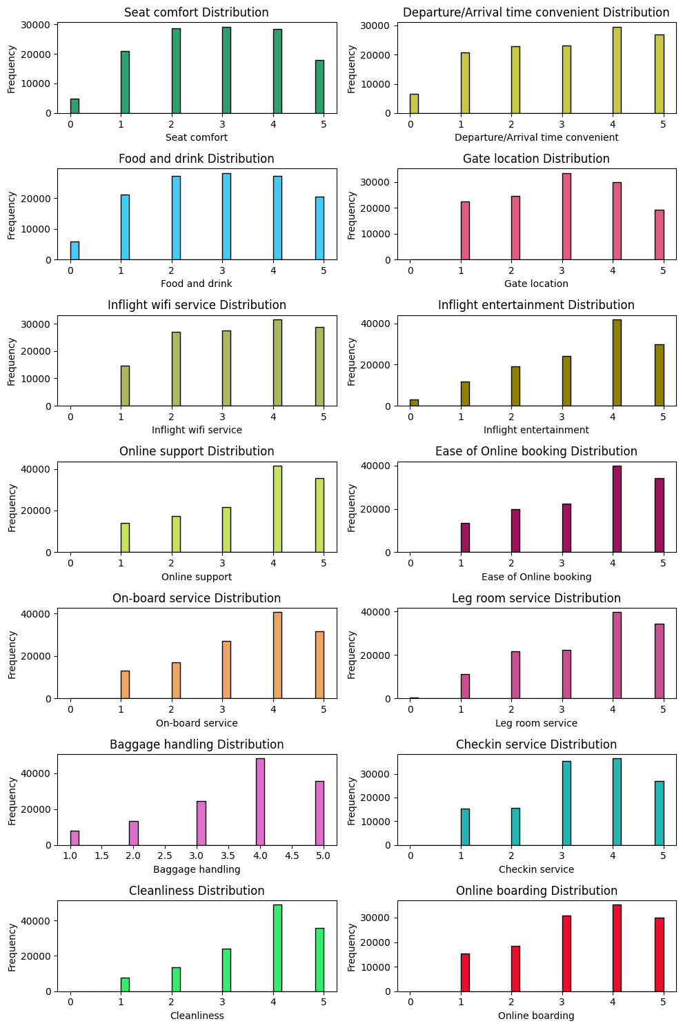
► 알 수 있는 정보
- 상위점수에 몰림 현상
- 중간점수에 몰림 현상
# 클래스 별 시각화
plt.figure(figsize=(15, 30))

for idx, column in enumerate(ordinal_columns):
    plt.subplot(len(ordinal_columns), 2, 2*idx + 1)
    plt.hist(satisfied[column], color='blue', label='Satisfied', bins=30, edgecolor='black')
    plt.xlim(0, 5)
    plt.title(f'Satisfied - {column}')

    plt.subplot(len(ordinal_columns), 2, 2*idx + 2)
    plt.hist(dissatisfied[column], color='red', label='Dissatisfied', bins=30, edgecolor='black')
    plt.xlim(0, 5)
    plt.title(f'Dissatisfied - {column}')

plt.tight_layout()
plt.show()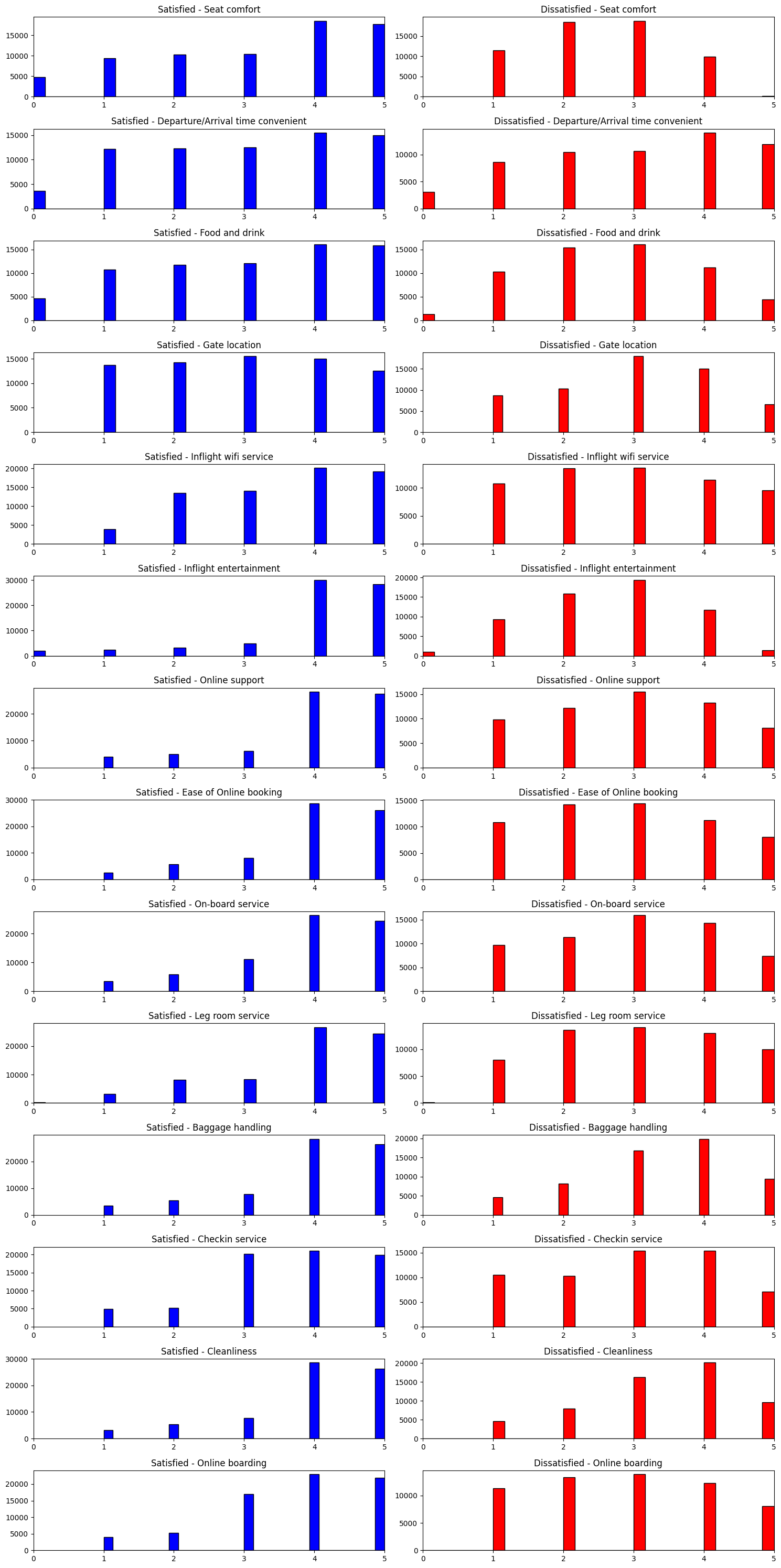
# 전반적인 평균과 치우침 확인
plt.figure(figsize=(8, 16))

np.random.seed(seed)
for idx, ordinal in enumerate(ordinal_columns) :

    plt.subplot(len(ordinal_columns)//2, 2, idx+1)
    plt.boxplot(ordinal_data[ordinal].dropna(), labels=[ordinal])

plt.tight_layout()
plt.show()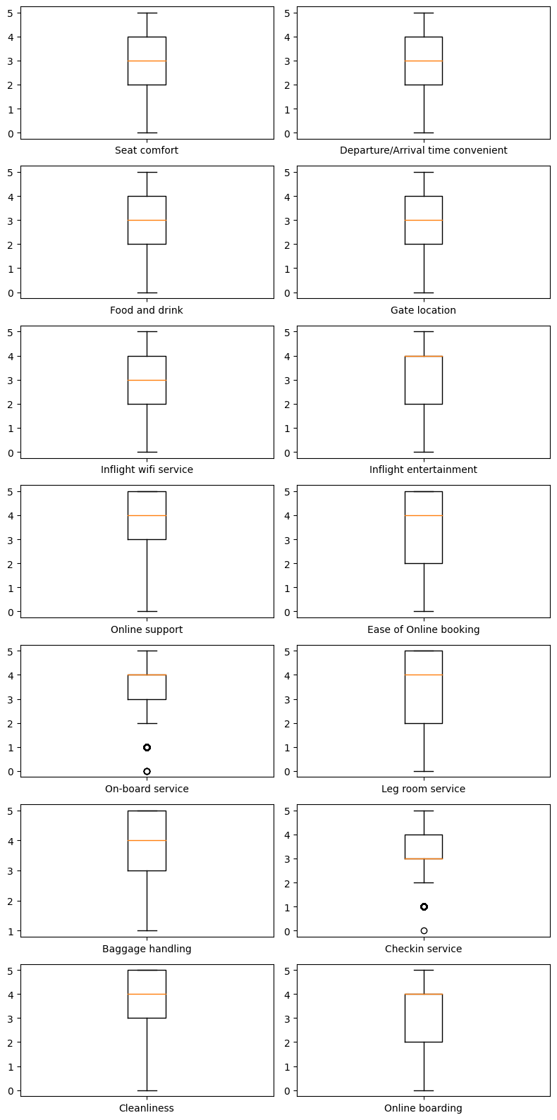
6) 상관관계 분석 - 서수형 데이터
correlation_matrix = ordinal_data.corr()

# 상관관계 메트릭스 시각화
plt.figure(figsize=(10, 10))

plt.matshow(correlation_matrix, fignum=1)
plt.colorbar()
plt.xticks(range(len(correlation_matrix.columns)), correlation_matrix.columns, rotation=90)
plt.yticks(range(len(correlation_matrix.columns)), correlation_matrix.columns)

for (i, j), val in np.ndenumerate(correlation_matrix):
    plt.text(j, i, '{:0.2f}'.format(val), ha='center', va='center', color='black')

plt.show()

# # 상관관계 값 프린트 > 너무 길어서 생략
# print('#'*20, '상관관계 값 확인', '#'*20)
# print(correlation_matrix)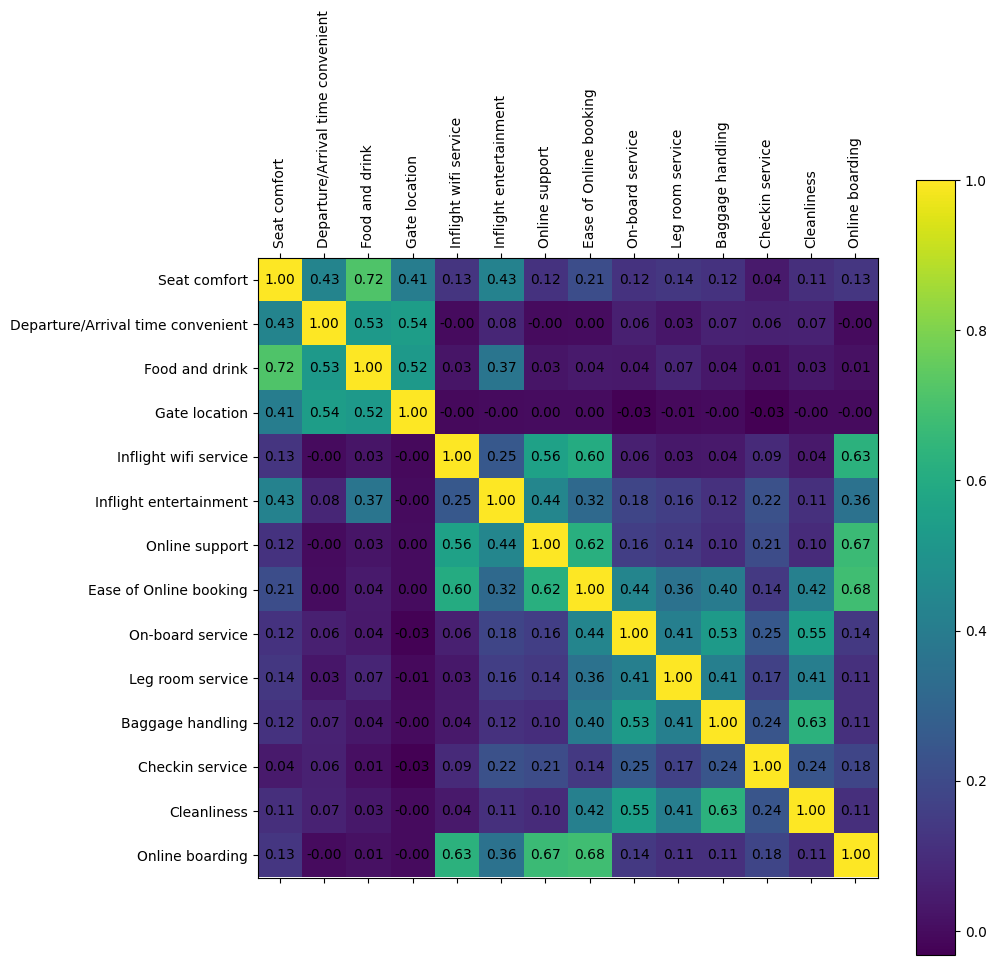
7) 시각화 - 범주형 데이터
# 전체 데이터 분포 확인
category_data = airplane[category_columns]

import matplotlib.pyplot as plt
plt.figure(figsize=(16, 4))

np.random.seed(seed)
for idx, category in enumerate(category_columns) :
    col = (np.random.random(), np.random.random(), np.random.random())

    plt.subplot(1, 4, idx+1)
    category_data[category].value_counts().plot(kind='bar', color=col)
    plt.title(column)
    plt.tight_layout()

plt.tight_layout()
plt.show()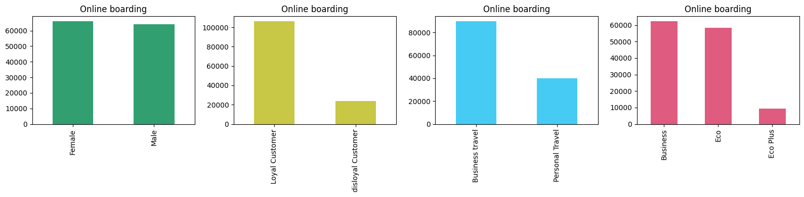
► 알 수 있는 정보
- 성별 : 응답 승객에서 성별 비율은 큰 차이가 없음
- 나머지 범주 데이터 :
- 설문을 포함한 만족도 조사에 있어 응답자 차이가 보임
- VIP / 일반 고객에서도 차이가 보임
- 비지니스 고객이 더 응답을 많이 했고 Ecoplus는 적음
# 클래스 별 시각화
plt.figure(figsize=(15, 12))

max_count_satisfied = max(satisfied[column].value_counts().max() for column in category_columns)
max_count_dissatisfied = max(dissatisfied[column].value_counts().max() for column in category_columns)
max_count = max(max_count_satisfied, max_count_dissatisfied) * 1.1

for idx, column in enumerate(category_columns):
    plt.subplot(2, 4, idx + 1)
    satisfied[column].value_counts().plot(kind='bar', color='blue')
    plt.title(f'Satisfied - {column}')
    plt.ylim(0, max_count)
    plt.tight_layout()

    plt.subplot(2, 4, idx + 5)
    dissatisfied[column].value_counts().plot(kind='bar', color='red')
    plt.title(f'Dissatisfied - {column}')
    plt.ylim(0, max_count)
    plt.tight_layout()

plt.show()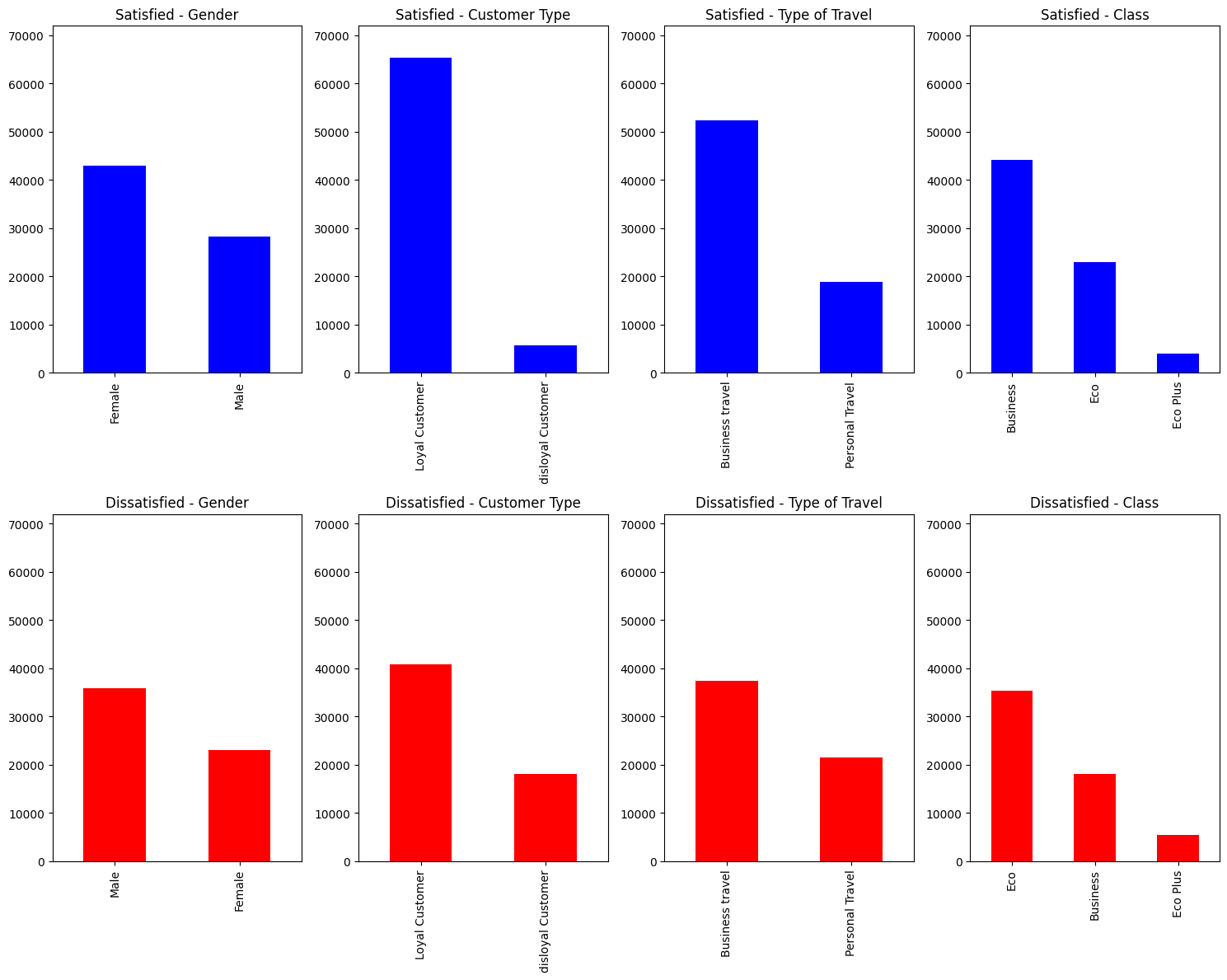
3단계. 데이터 전처리
1) 데이터 제거
## NA 및 EDA를 기반으로 제거할 값 제거

airplane_cleaned = airplane.dropna() # na값 제거
time_limit = 300 # 지연 시간 5시간 이상은 제거
airplane_cleaned = airplane_cleaned[(airplane_cleaned['Arrival Delay in Minutes'] < time_limit) &
                                    (airplane_cleaned['Departure Delay in Minutes'] < time_limit)]

airplane_cleaned.info()
2) 범주형 변수 One-hot Encoding
- 종속변수 : 만족도
- 독립변수 : 성별, 고객 유형, 여행 유형, 클래스
airplane_cate_encoded = pd.get_dummies(airplane_cleaned[category_columns], drop_first=True)
airplane_target_encoded = pd.get_dummies(airplane_cleaned[y_column], drop_first=True)


airplane_combined = pd.concat([airplane_target_encoded,
                               airplane_cleaned[numeric_columns + ordinal_columns],
                               airplane_cate_encoded],
                              axis=1)
airplane_combined
3) 일부 특성만 사용
- 상관관계가 큰 특성만 취할 것이다
- 밝은 쪽이 결과에 영향을 많이 미치고 있다는 의미
- 해석력과 일반화 향상을 위해 23개 변수 중 15개만 취해서 학습 진행
# 모든 변수 간 상관관계를 계산
correlation_matrix_combined = airplane_combined.corr()

plt.figure(figsize=(20, 20))

plt.matshow(correlation_matrix_combined, fignum=1)
plt.colorbar()
plt.xticks(range(len(correlation_matrix_combined.columns)), correlation_matrix_combined.columns, rotation=90)
plt.yticks(range(len(correlation_matrix_combined.columns)), correlation_matrix_combined.columns)

for (i, j), val in np.ndenumerate(correlation_matrix_combined):
    plt.text(j, i, '{:0.2f}'.format(val), ha='center', va='center', color='black')

plt.show()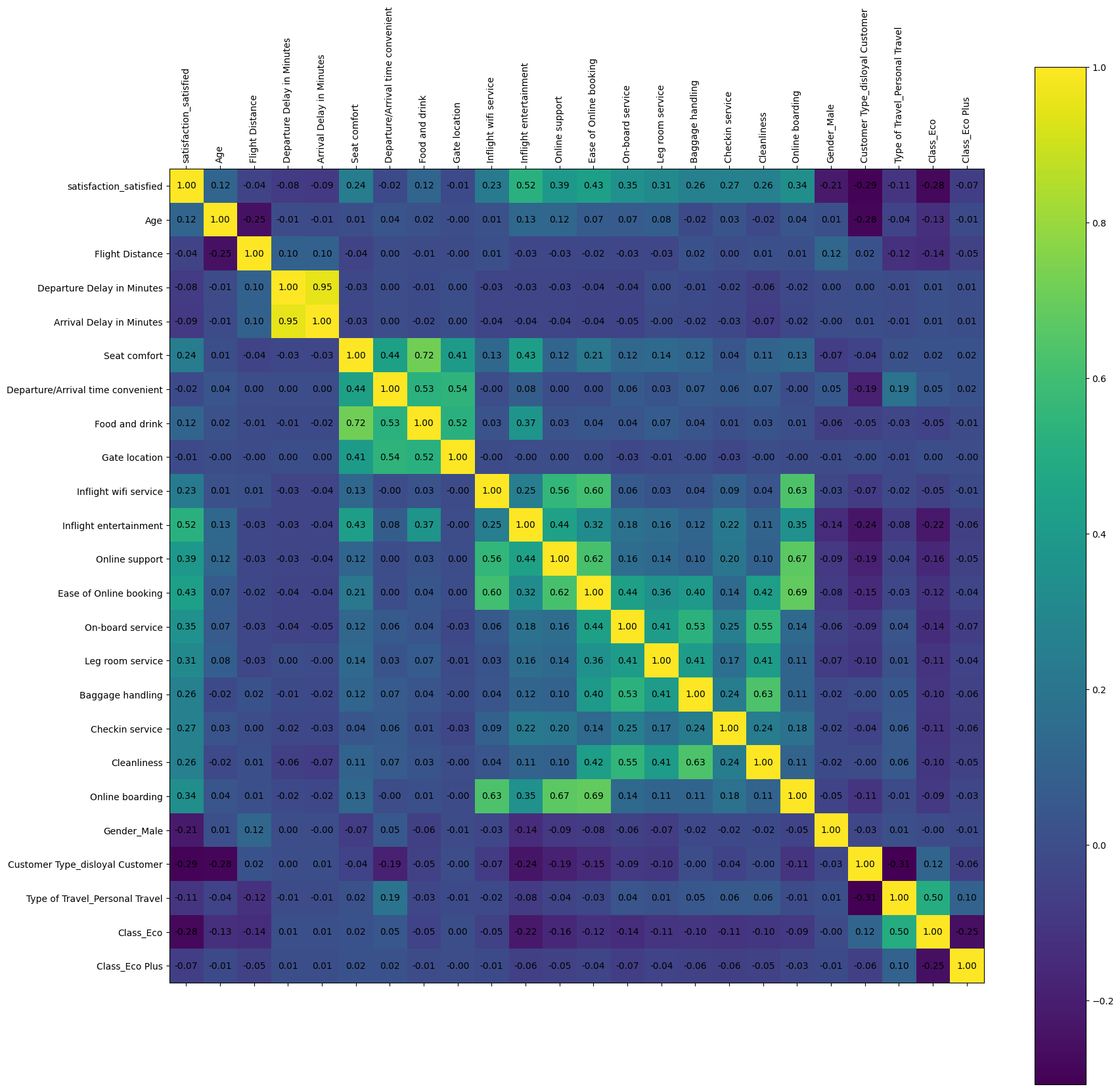
# 목표로 하는 target column과 가장 상관관계가 큰 15개를 선택!
select_num = 15
target_correlations = correlation_matrix_combined[airplane_target_encoded.columns[0]].abs().sort_values(ascending=False)
top_features_with_target = target_correlations[1:select_num+1].index.tolist() # 상위 15개만 (0부터 하면 자기 자신이 나올수도 있으므로 1부터)
top_features_with_target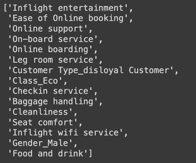
# 위의 상관관계가 변수 15개만 가지고 새로운 데이터 생성
# 0번이 종속변수, 그 밑에 1~15번까지가 독립변수
data = airplane_combined[target_correlations[:select_num+1].index.tolist()]
data.info()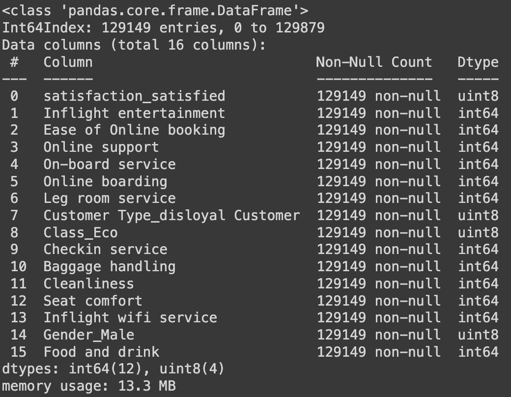
# 추출된 특징 이름
# 수치형 데이터는 추출 x
y_column = ['satisfaction_satisfied']
ordinal_columns = ['Inflight entertainment', 'Ease of Online booking',
                   'Online support', 'On-board service',
                   'Online boarding', 'Leg room service',
                   'Checkin service', 'Baggage handling',
                   'Cleanliness', 'Seat comfort',
                   'Inflight wifi service', 'Food and drink']
category_columns = ['Customer Type_disloyal Customer', 'Class_Eco',
                    'Gender_Male']
4단계. 데이터 분리 (학습 / 평가)
학습 : 평가 = 80:20 비율로 분할
from sklearn.model_selection import train_test_split

X = data.drop(y_column, axis=1)
y = data[y_column]
X_train, X_test, y_train, y_test = train_test_split(X, y,
                                                    test_size=0.2,
                                                    random_state=42)
5단계. 선형 분류 모델(로지스틱 회귀) 학습
## w0에 해당하는 편향(bias) 부분 추가 x

from sklearn.linear_model import LogisticRegression

# 선형 회귀 모델 초기화 및 학습
logistic_reg = LogisticRegression()
logistic_reg.fit(X_train, y_train)


# 학습된 모델의 계수(coefficients) 및 절편(intercept) 출력
coefficients = logistic_reg.coef_
intercept = logistic_reg.intercept_

print('#'*20, '학습된 파라미터 값', '#'*20)
print(coefficients)

print('#'*20, '학습된 절편 값', '#'*20)
print(intercept)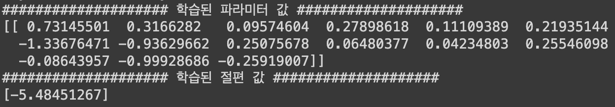
6단계. 학습한 모델 평가
1) 정확도(Accuracy)
: 예측한 결과가 실제 결과의 일치 or 불일치를 기반으로 정확도를 구할 수 있음
정확도 = 일치하는 데이터 / 전체 데이터
from sklearn.metrics import accuracy_score

# 예측 수행
y_train_pred = logistic_reg.predict(X_train)
y_test_pred = logistic_reg.predict(X_test)

# 평가 지표 계산: 정확도 (맞은수/전체)
acc_train = accuracy_score(y_train, y_train_pred)
acc_test = accuracy_score(y_test, y_test_pred)

print('학습 데이터를 이용한 Acc 값 :', acc_train)
print('평가 데이터를 이용한 Acc 값 :', acc_test)
2) Confusion matrix
: 예측과 실제 결과값을 기준으로 표를 생성
(좌상 → 우하 방향 대각선 위치의 값이 클수록 좋은 결과)
학습 데이터를 활용
# Confusion matrix 생성을 위한 준비
from sklearn.metrics import confusion_matrix

cm_train = confusion_matrix(y_train, y_train_pred)
cm_test = confusion_matrix(y_test, y_test_pred)

# 학습 데이터를 활용한 confusion matrix

plt.imshow(cm_train, interpolation='nearest', cmap='Blues')
plt.title("Confusion Matrix (Train)")
plt.colorbar()
tick_marks = np.arange(len(np.unique(y_train)))
plt.xticks(tick_marks, np.unique(y_train))
plt.yticks(tick_marks, np.unique(y_train))
plt.xlabel("Predicted Label")
plt.ylabel("True Label")

# 각 셀에 숫자 표시
for i in range(cm_train.shape[0]):
    for j in range(cm_train.shape[1]):
        plt.text(j, i, cm_train[i, j], ha="center", va="center", color="black")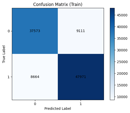
평가 데이터를 활용
# 평가 데이터를 활용한 confusion matrix

plt.imshow(cm_test, interpolation='nearest', cmap='Blues')
plt.title("Confusion Matrix (Test)")
plt.colorbar()
tick_marks = np.arange(len(np.unique(y_test)))
plt.xticks(tick_marks, np.unique(y_test))
plt.yticks(tick_marks, np.unique(y_test))
plt.xlabel("Predicted Label")
plt.ylabel("True Label")

# 각 셀에 숫자 표시
for i in range(cm_test.shape[0]):
    for j in range(cm_test.shape[1]):
        plt.text(j, i, cm_test[i, j], ha="center", va="center", color="black")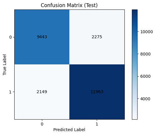
7단계. 결과 해석
1) 변수의 중요도
coeff_df = pd.DataFrame({'feature': X_train.columns, 'coefficient': logistic_reg.coef_.flatten()})

# 계수의 절대값을 기준으로 내림차순 정렬
coeff_df['abs_coefficient'] = coeff_df['coefficient'].abs()
coeff_df_sorted = coeff_df.sort_values(by='abs_coefficient', ascending=False)

# 변수의 영향력을 확인
coeff_df_sorted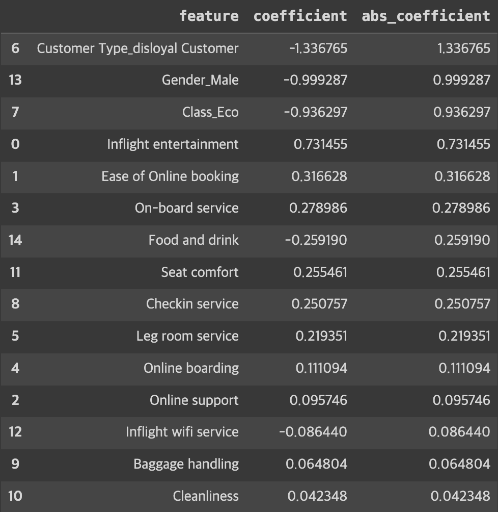
# 변수 영향력 시각화
plt.figure(figsize=(10, 6))
plt.barh(X_train.columns, logistic_reg.coef_.flatten())
plt.xlabel('Coefficient')
plt.ylabel('Features')
plt.title('Features Importance')
plt.show()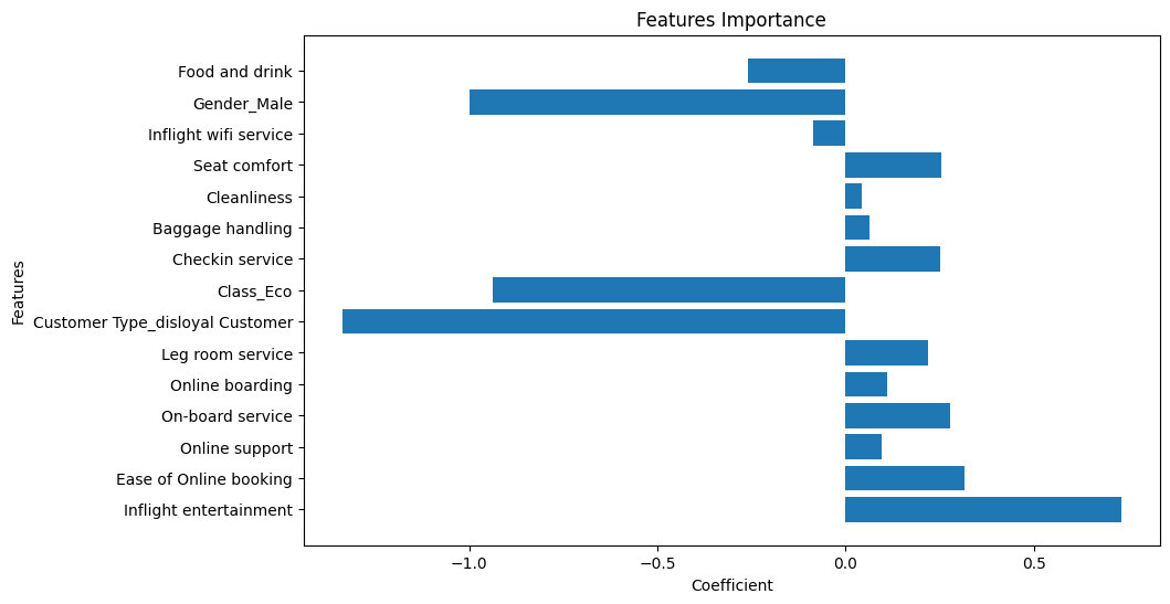
► 알 수 있는 정보
- 로얄 고객이냐/아니냐가 만족도 예측에 영향을 크게 미친다.
- 성별이 여성일 경우 만족도 예측에 영향을 크게 미친다.